Having visually appealing and responsive websites is paramount in the ever-changing web development environment. CSS Grid Layout is the developer’s most potent weapon for delivering on this. This comprehensive tutorial will introduce you to the foundations of CSS Grid and help you master 10 essential CSS Grid techniques when creating responsive web designs.
What is CSS Grid Layout?
CSS Grid Layout, or simply “Grid” or “CSS Grid,” is a two-dimensional grid system that revolutionizes how we create user interfaces differently from traditional web layout methods. CSS has been used to lay out our web pages, but it has not been successful. We initially used tables, floats, positioning, and inline-block, yet all of those were essentially workarounds that didn’t deliver many of the capabilities we require (like centering vertically, for example). Flexbox is also an excellent layout mechanism, yet its one-way flow is better applied to other scenarios, complementing each other very well. Grid is the first CSS module designed to fulfill the needs of our layouts, which we’ve been working on since creating websites.
1. Understanding the Basics of CSS Grid
Grid Container
The key to a CSS Grid layout is the Grid Container; therefore, it is essential. It is a specific HTML element that acts like a container and the display grid; the property is made to it. After placing the grid, you can change it into a quality grid system and syndicate the child elements in several ways.

Grid Lines
CSS Grid has a key concept called grid lines. Those lines break the grid into columns and rows, making placing and aligning the grid items possible. Grid lines are grouped into two types:
- Column lines (vertical lines)
- Row lines (horizontal lines)
When a new column or row is created, two new grid lines are created: one at the starting and ending points.
Grid Tracks
Grid tracks are the spaces bounded by the adjacent grid lines between the grid columns and rows. As a result, the CSS grid properties such as `grid-template-columns` for columns and `grid-template-rows` for rows may define these tracks.
And this is how it can be done:
- To define your tracks, you must first state their sizes or behaviors.
- Each track can alter its size based on content or be assigned an explicit size using units like pixels, percentages, or fractions of available space (fr).

2. Exploring Grid Items, Grid Cells, and Grid Areas
Grid Items
Grid items are the immediate offspring of the grid container. Every item is placed in a particular grid cell, which is determined by the intersection of any row and column. Several CSS properties can be used inside the grid to position, size, and align grid items. By default, grid items are automatically positioned in the next available cell. However, they can also be intentionally positioned using methods based on lines or designated areas.

Grid Cells
Grid cells are the individual cell areas in a grid that hold grid items. The location of each cell, which is located around specified grid lines, defines the cell. The grid cell forms the basic building block of the grid that defines the space where one grid item exists. An item placed as a grid item is placed in an area that covers one or more grid cells based on size and position.
Grid Areas
Grid areas are chunks of the grid, each containing many grid cells. By spreading items across multiple rows and columns, they can create more advanced designs. Grid areas are made using named areas in the grid template, which improves code quality and readability.

3. Creating a Basic CSS Grid Layout
The process begins with defining a grid container and setting the desired quantity of columns and rows.

This layout defines a grid pattern of three columns of equal width and automatic row heights. The repeat() function is handy for creating repetitive track patterns without defining each track individually.
4. Defining Columns and Rows in CSS Grid
In CSS Grid, the two properties, grid-template-columns and grid-template-rows, contribute significantly to the grid’s design structure. They create lanes of columns and rows, which design the grid’s layout.
Establishing Column Tracks with grid-template-columns:
The grid-template-columns property lets you define the number and the widths of columns within the grid container. You can create column tracks of fixed, adaptable, or a blend of both types, assigning values to this property.

In other words, the grid-template-columns property sets the column arrangement of a CSS Grid layout. The example provided can be described as follows:
The CSS will create a grid container split into five columns. The first column is now set to be 200 pixels wide; the second takes one fraction of the remaining space for width; the following two fractions of the remaining space are within the third column; the fourth column is auto-sized based on the length of the content; the last column is set to take 10 percent of the width of the container.
The fr unit facilitates a flexible allocation of the remaining space within the grid container.
Determining Row Tracks with grid-template-rows:
Along these lines, the rows within your grid can be indicated by grid-template rows. This property uses the height of each row track as its attribute.

The grid-template-row property organizes the rows into a CSS grid layout:
- The first row would take about 10% of the overall height of this container.
- The second row will be measured automatically based on whatever is present.
- The third row will have a fixed height of 200 pixels.
- The fourth row will thus take up two-thirds of the remaining space.
- The function repeat (3, 1fr) will add three more identical rows, each 1fr tall after all the other fractions have been defined.
5. Placing Items in Specific Grid Cells
One of the ways to arrange grid items accurately is by utilizing line-based placement:

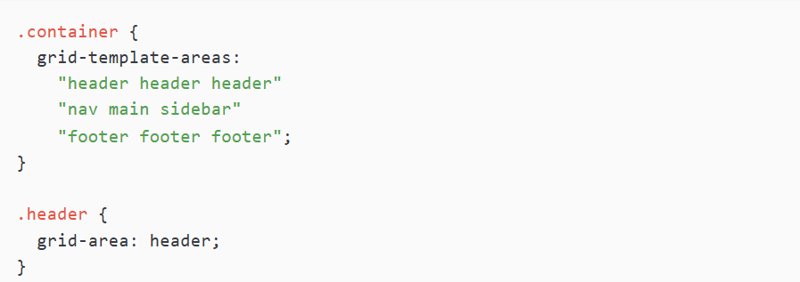
The other option to make the code more understandable is using named areas:

6. Creating Grid Gaps for Spacing
Additionally, the gap property (or grid-gap for older browsers) will enable you to nominate equal spacing between grid items:

7. Aligning and Justifying Items in the Grid
CSS Grid has potent properties of aligning:
- Align and justify items are used for all items aligned to the grid.
- Align-self and justify-self are also used to align individual items of the grid.
- Place-items, a one-liner, helps you set both properties using just one trick.
 8. Changing the Order of Grid Items
While the Grid usually refers to a two-dimensional layout, pretty much all items’ visual order can be changed with the order property:

9. Creating Responsive CSS Grid Layouts
The responsive layout successfully applies different functionalities of the CSS Grid in various ways: fluid tracks specified using the units fr; media queries that change the layout at specific breakpoints; the minimax() function to specify adjustable dimensions in specific tracks; and columns that self-detect their fit using auto-fill and auto-fit with the usage of repeat().

10. Building Complex Grid Structures
Advanced techniques include:
- Nested grids for complex layouts
- Overlay grids for creative design patterns
- Asymmetric grids for dynamic and modern layouts
- Responsive grid animations for smooth transitions
Conclusion
The CSS Grid Layout provides developers with a revolutionary design instrument that gives total command and adaptability when building sophisticated responsive page arrangements. You can build contemporary dynamic web applications by studying the provided grid setup fundamentals and responsive design techniques. Your understanding of CSS Grid will lead to design development and functional growth, resulting in smooth user interactions on all devices. Web development advancement requires you to adopt CSS Grid layout and tools, simplifying design work to excel in current trends.
